


Why “Nits” Aren’t the Whole HDR Story: Understanding Contrast Ratio
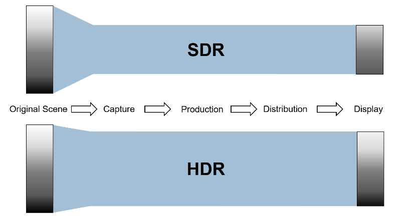
Ask most people what makes HDR look better than standard video, and they’ll say “it’s brighter.” That’s true, but it’s only half the picture — literally. The other half is contrast ratio: the total range between the darkest black and the brightest white a display can produce in the same scene. A screen that gets very bright but can’t also get convincingly dark isn’t actually delivering HDR’s real advantage.
Brightness alone doesn’t create impact
Vision scientists have understood for decades that perceived picture “sharpness” and impact come from contrast at least as much as from resolution or raw brightness. A scene with a wide contrast ratio — deep, detailed shadows sitting right next to bright, detailed highlights in the same frame — reads as more three-dimensional and realistic than a scene that’s simply been made brighter overall. That’s why two displays with the same peak-brightness spec, measured in nits, can produce noticeably different-looking HDR if their contrast ratio differs.
What “losing” contrast actually looks like
When a display or format can’t reproduce a scene’s full contrast range, the failure shows up at both ends. Highlights that should retain subtle detail — clouds, reflections, bright windows — get “blown out” into flat white. Shadows that should retain texture — the folds in dark clothing, detail in a nighttime scene — get “crushed” into flat black. Both are information loss, and both are exactly what a wide dynamic range is designed to prevent: retaining detail simultaneously at both extremes of a scene, not just pushing the whole image brighter.
How HDR10+ protects contrast scene by scene
This is where HDR10+’s dynamic metadata earns its keep. A static, one-size-fits-all tone-mapping curve has to compromise across an entire program, which means it’s frequently wrong for any individual scene — sacrificing shadow detail in a dark scene to avoid clipping highlights in a bright one, or vice versa. HDR10+ instead builds a tailored tone-mapping curve for each individual scene, based on that scene’s actual brightness distribution, so contrast is optimized for what’s actually on screen at that moment rather than for the program as a whole.
Why this matters more as displays get brighter
As premium televisions push peak brightness higher — some now exceeding 4,000 nits — the gap between a display’s peak brightness and its ability to also hold deep, detailed blacks becomes more visible, not less. A very bright display with mediocre black levels can end up looking less realistic than a dimmer one with excellent contrast. Preserving contrast ratio, not just chasing peak nits, is what keeps HDR looking like a genuine improvement rather than just a brighter version of the same picture.
Independent confirmation
Technical coverage of HDR’s Perceptual Quantization curve — the transfer function HDR10+ is built on — backs this up. ktcplay’s breakdown of PQ notes that in practical display terms, PQ gives the strongest path toward the director’s or game artist’s intended contrast, provided the display tracks the curve accurately and tone maps responsibly — precisely the scene-by-scene optimization HDR10+’s dynamic metadata is designed to deliver.
Read ktcplay’s full explainer on PQ vs. HLG transfer functions for more technical background.